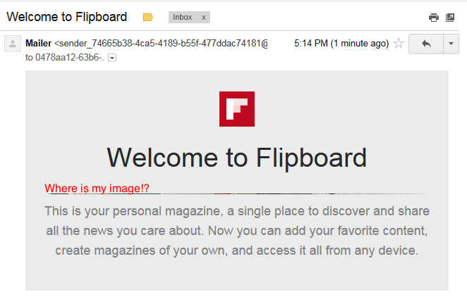
Lately I have had to redo some of the HTML emails. We had an outside contractor do most of the work and he did a fantastic job. However, I was noticing that under a very specific condition, the email images were not rendering properly in desktop Gmail on Internet Explorer 10. I have no idea how many people are using GMail+IE10 but since this is our first real contact with the user, I though it would be important to ensure the best user experience possible. Broken images are not a good experience.
Here is the problem:

Old HTML
<img class="imageScale"
style="display: block; width: 550px; height:auto;"
width="550" height="auto" src="{{ img_url }}"
border="0" />
New HTML
<img class="imageScale"
style="display: block; width: 550px;" src="{{ img_url }}"
border="0" />
Final outcome:

Why does it fix it?
I came across a couple of quirks at play in this porblem.
First, I learned that GMail automatically converts CSS height attribute to min-height with reckless abandon.
Second, the original HTML IMG tags have height:auto. With GMail’s reckles height conversion it becomes min-height:auto which essentially means 0px or 1px.
To solve, I removed height attributes on the img tags. It turns out that all of the browsers will automatically just render the image at full size of the parent container. In this case we have a series of nested tables that set maximum width of the parent to about 550 and the minimum width is 100% of screen width.
